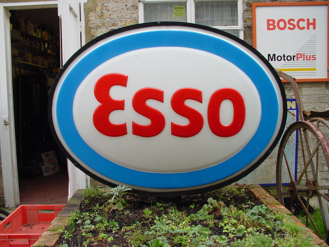
The history of Esso garage signs is a captivating journey that spans decades and mirrors the evolution of a global energy giant. From its humble beginnings to becoming a ubiquitous presence on roadways, Esso's iconic signs have not only guided motorists but also reflected the brand's commitment to innovation and adaptability. This exploration will delve into the rich history of Esso garage signs, tracing their development, design evolution, and cultural significance.
Early Beginnings:
The story of Esso garage signs can be traced back to the early 20th century when the company itself was in its infancy. Esso, short for Standard Oil, emerged from the breakup of John D. Rockefeller's oil empire in 1911. The name Esso itself was coined from the pronunciation of the initials "S" and "O," representing Standard Oil. As the company expanded its operations globally, it became imperative to establish a strong visual identity, and thus, the concept of garage signs was born.
The Birth of the Esso Logo:
The first Esso garage signs featured a simple yet distinctive design – a red oval with a bold, white uppercase "ESSO" at its center. This basic design made its debut in the 1930s and quickly became synonymous with the brand. The choice of red for the oval was intentional, symbolizing energy, passion, and dynamism. This initial design laid the foundation for future iterations and remains recognizable to this day.
Innovations in Illumination:
As technology advanced, so did the design and functionality of Esso garage signs. One of the significant innovations was the introduction of illuminated signs. In the 1940s, neon lights became popular, and Esso embraced this trend to create eye-catching signs that stood out during both day and night. The integration of neon lights not only enhanced visibility but also added a touch of glamour to the signs, turning them into beacons along highways.
Cultural Impact and Brand Recognition:
Esso's commitment to consistent branding and memorable signage contributed to the brand's widespread recognition. The red oval with the bold white "ESSO" became a familiar sight for motorists, creating a sense of trust and reliability. This visual consistency played a crucial role in building brand loyalty and establishing Esso as a global leader in the petroleum industry.
Adapting to Change:
Over the years, the design of Esso garage signs underwent several modifications to stay relevant in the ever-changing landscape of advertising and branding. In the 1960s, the company introduced a new logo featuring a blue background with a stylized white tiger, symbolizing power and energy. This marked a departure from the traditional red oval but retained the essence of the brand.
The Oil Crisis and Rebranding:
The 1970s brought about significant challenges for the oil industry, including the oil crisis and increased environmental awareness. In response, Esso underwent a rebranding effort to emphasize its commitment to environmental responsibility. The garage signs were updated to incorporate a more modern and eco-friendly design, featuring a green color scheme and a stylized drop of oil.
Globalization and Standardization:
As Esso expanded its global footprint, the need for standardized signage became evident. The company aimed to create a consistent visual identity that would resonate across diverse cultures and languages. The red oval with the white "ESSO" remained a central element, ensuring that motorists worldwide could easily identify and trust the brand.
Mergers and Acquisitions:
Esso's history is intertwined with a series of mergers and acquisitions, leading to changes in branding and signage. Notably, the acquisition of Humble Oil in the United States in 1919 brought the Esso brand to American soil. In 1973, Esso became Exxon, adopting a new name and logo, yet retaining the essence of the iconic red oval. This change also led to modifications in garage signs to reflect the Exxon brand.
Revival of the Esso Brand:
Despite the rebranding efforts, the Esso brand continued to thrive in many parts of the world. In the early 2000s, ExxonMobil, the parent company of Esso, decided to revive the Esso brand in certain markets. This led to the reintroduction of Esso garage signs in regions where the brand had a strong historical presence.
Modern-Day Esso Garage Signs:
In the 21st century, Esso garage signs have evolved to meet contemporary design standards while preserving the brand's heritage. The iconic red oval is still a prominent feature, often accompanied by a sleeker and more modern typeface. Digital signage and LED technology have also been integrated, allowing for dynamic and interactive displays that engage motorists in new ways.
Conclusion:
The history of Esso garage signs is a testament to the brand's resilience and adaptability in the face of changing times. From the simplicity of the early red oval to the stylized tiger and the green, eco-conscious designs, Esso's garage signs have mirrored the company's commitment to innovation, environmental responsibility, and global expansion. As these signs continue to guide motorists on their journeys, they also serve as visual markers of a brand that has withstood the test of time, leaving an indelible mark on the cultural landscape of the petroleum industry.
